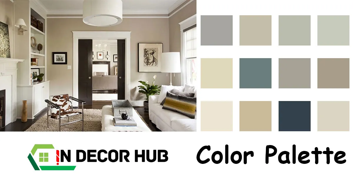
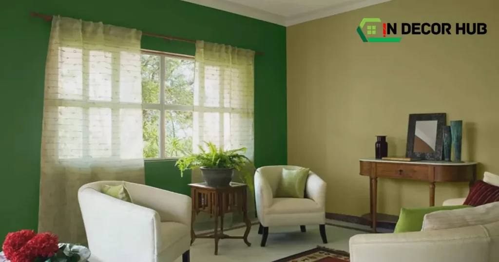
The best paint color for an entire house interior is often a neutral tone such as off-white or light gray. These hues create a sense of unity and spaciousness.
Selecting the ideal paint color for your home’s interior is crucial, as it sets the mood and tone for your entire living space. Neutral tones like off-white, beige, and light gray remain popular due to their versatility and ability to complement various decors and architectural styles.
They give the illustration of light and help rooms to appear bigger and brighter, while also showing a perfect framework for art or accent colors. When you go with the to-play-it-safe using neutral colors, you can easily vary your accessories and furnishings without thinking about color clash, and that is how your home achieves harmony and even looks over the years.
Table of Contents
1. The Psychology Of Color In Home Design
Colors bring life to our homes. Choosing the right paint color is more than just a visual choice—it’s about creating the right feel. We can be greatly stimulated or pleased by the colors we surround ourselves with. This part discusses the rules of emotion and painting at home. In this article, we will going to explore, how, with the right choice of hues our entire dwelling could have a certain mood.
Influence On Mood And Atmosphere
Every color has power. Warm tones like reds, oranges, and yellows can energize a space. They help in making a room feel cozy and lively. On the other hand, cool tones such as blues, greens, and purples bring calm. They often create a serene and soothing environment.
- Red stirs energy, perfect for a lively dining area.
- Yellow boosts happiness, which is ideal for kitchens.
- Blue encourages relaxation and is best for bedrooms.
Neutral colors, like grays and beiges, offer flexibility. They can be paired with bold accents to balance the mood.
Color Perception And Cultural Associations
Colors carry meanings beyond our internal feelings. A different connotation is given to colors by diverse cultures. These pairings should be considered even when choosing colors for your house. Here’s a breakdown:
| Color | Meaning |
| White | Purity in some cultures, mourning in others |
| Black | Power and sophistication or mourning |
| Red | Luck and celebration in the East, danger in the West |
| Blue | Trust and peace worldwide |
Understanding these associations helps in creating a welcoming home. It also guarantees your area respects numerous backgrounds.
2. Current Trends In Interior Colors
The quest for the ideal paint coloration to blanket your own home’s indoor partitions is ever-evolving. A fusion of psychology and artistry, current trends in interior colors veer towards hues that create atmospheres of serenity, energy, and balance.
As owners seek out the embody of comforting sunglasses, those traits also reflect collective moods and design sensibilities. Today we will explore the hues that are the most influential among those who design modern interiors.
Popular Hues For Modern Homes
Contemporary homes receive a fresh breath of life with a well-curated selection of colors. Neutral shades like greige – a blend of gray and beige – remain steadfast favorites. Such hues offer unparalleled flexibility, seamlessly flowing from room to room.
Deep blues and soft greens introduce a touch of the natural world indoors, endorsing calm and focus. For a dash of sophistication, muted terracotta brings warmth while maintaining chic subtlety.
- Greige: Perfect blend of warmth and modernity
- Navy Blue: Confidence and depth in one stroke
- Sage Green: A tranquil, earthy presence
- Muted Terracotta: Earthy yet refined for a cozy feel
Emerging Color Palettes In Interior Design
In the dynamic arena of interior design, emerging color palettes are informed by the latest cultural pulses. Assemblages of soft pastels are making waves, imparting an air of light-heartedness amidst contemporary furnishings.
On the other end of the spectrum, jewel tones present lavishness and drama without overwhelming. These palettes sign a shift towards embracing personal taste with bold warranty.
| Palette | Vibe |
| Soft Pastels | Upbeat and uplifting |
| Jewel Tones | Luxurious and captivating |
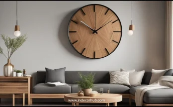
3. Factors To Consider When Choosing Paint
Choosing the right paint color transforms a house into a home. Let’s discover a few key elements of this procedure.
Lighting And Room Size
Light penetrates spaces differently, impacting how paint colors appear. Consider natural and artificial light sources. Here’s a quick guide:
- North-facing rooms: seek warm hues to counteract cool light.
- South-facing rooms: enjoy bright light, suitable for most colors.
- Ambient light: influences the mood; soft colors aid in relaxation.
Bigger rooms require careful color choice to avoid feeling empty. Darker colors add coziness while lighter hues create openness. Here’s a tableau:
| Room Size | Color Depth | Effect |
| Small | Light | Expansive |
| Large | Dark | Intimate |
Existing Furniture And Decor Elements
Assess your current belongings. Aim for harmony between walls and items. Here’s what to ponder:
- Undertone matching: Align wall tones with decor for cohesion.
- Standout pieces: Use color to accentuate or blend in furniture.
- Theme consistency: Keep a unified look throughout your space.
Match or contrast – both strategies can work. Prioritize a balanced, aesthetically pleasing environment.
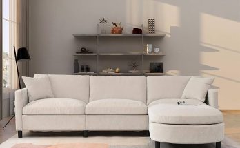
4. Neutral Tones: A Safe And Versatile Choice
When picking a color palette for your home’s interior, neutrals reign as the supreme choice. Neutral tones offer unmatched versatility, pairing effortlessly with both vibrant accents and other understated hues. They create a backdrop that permits your decor to be polished. Let’s dive into the arena of grays, beiges, and whites and apprehend why they’re frequently the pass-to colors for plenty of house owners.
Perks Of Picking Grays, Beiges, And Whites
- Timeless Elegance: Greys, beiges, and whites offer a classic look that never goes out of style.
- Flexibility: These colors serve as a neutral foundation for any design changes you might want to make in the future.
- Space Enhancement: Lighter neutrals can make smaller spaces appear larger and more inviting.
- Saleability: Neutral interiors often appeal to buyers, making it easier to sell your home.
Combining Neutrals For A Cohesive Look
Creating a cohesive look throughout your home is simple with neutral tones. Start with a base color like warm beige or cool gray. Then, layer in various shades and textures to add depth and interest. Whites can be used for trims and ceilings to feature crisp lines and brightness.
| Base Tone | Accent Neutrals | Textures to Consider |
| Warm Beige | Ivory, Taupe | Linen, Wool |
| Cool Gray | Slate, Silver | Velvet, Faux Fur |
5. Bold Colors To Elevate Your Space
Choosing the right paint color transforms a home. Bold colors make spaces vibrant and expressive. They reflect your style and bring energy to your interiors. Let’s dive into a way to use those powerful colorations to create a hanging appearance at some point in your own home.
Strategic Use Of Vivid Tones
Inject life into your rooms with strategic splashes of color. Consider a bright blue for the kitchen. It brings a sense of calmness. Turn to rich emerald green in your study for a touch of elegance. Bedrooms benefit from a warm, deep burgundy, enhancing the cozy vibe.
- Entryways: Welcome with a pop of yellow.
- Living Areas: A bold red sparks conversations.
- Restrooms: Playful purples add fun.
Pairing Bold Colors And Subdued Accents
Balance is key. Pair bold colors with neutral accents. A jewel-toned room can have white trim. Soft gray furnishing complements a bright wall. This creates harmony.
| Room | Bold Color | Subdued Accent |
| Living Room | Navy Blue | Beige |
| Dining Area | Forest Green | Taupe |
| Bedroom | Plum | Soft White |
6. The Enduring Charm Of Pastel Colors
Pastel colors bring a timeless charm to any home’s interior. They provide a diffused trace of coloration while preserving a calming ecosystem. These colorings stand to take a look at the time, growing environments that sense ethereal and light. Homeowners often favor pastel shades for their ability to make spaces feel larger and more inviting.
Creating Soft, Welcoming Spaces
Pastel colors have a unique ability to transform a room into a haven of comfort. Soft pinks, gentle blues, and creamy yellows work together to create an ambiance of warmth. These colors reflect light beautifully, contributing to a bright and open feel throughout the house.
Ways pastels make rooms welcoming:
- Bounce natural light around
- Create a calm, peaceful setting
- Enhance room size and openness
Mixing Pastels With Neutral Shades
Pastel tones pair well with neutrals for a balanced interior color palette. Consider ivory, beige, or gray as foundational colors. Add pastel accents to give each room a touch of personality. This mix ensures that spaces are not overwhelming but full of character.
| Pastel Color | Neutral Pairing |
| Soft Pink | Warm Beige |
| Baby Blue | Cool Gray |
| Pale Yellow | Creamy White |
7. Monochromatic Schemes For A Modern Touch
Choosing the best paint color for your home’s interior often leads to monochromatic schemes. These schemes use one color in varying shades. The reflective nature of modern homes provides an upscale coordinated appearance. Such a fashion is quintessential for people who want to modernize the appearance of their house. Now, we will additionally navigate how to come up with such an effect to change your place.
Layering Different Shades Of The Same Color
Layering colors add interest to rooms. Start with a base color. Choose lighter and darker shades of this color. Use them across extraordinary factors. Walls, furnishings, and decor can all play an element. This technique helps create a harmonious area. It nevertheless gives visible variety.
- Walls: Paint your main walls with a medium shade. Accent walls can have a darker shade.
- Trim: Use the lightest shade for trims. This includes baseboards and door frames.
- Accent Pieces: Add depth with darker furniture or rugs.
Textural Elements To Add Depth
Textures make monochromatic rooms stand out. Combine different materials to enhance the look. Soft fabrics, rough textures, and shiny surfaces work well together. They create a sense of depth.
| Material | Examples |
| Soft Fabrics | Curtains, Throw Pillows, Blankets |
| Rough Textures | Jute Rugs, Wicker Baskets |
| Shiny Surfaces | Metal Light Fixtures, Glass Decor |
Textural contrasts can define spaces. Include a mix of textures for a visually interesting home. This will make your monochromatic color scheme come alive.
8. Earthy Tones For A Natural Feel
Create a calming oasis in your home with earthy tones. These paintings are expressions of life that define the harmony between humans and nature through the use of given colors. As people will tell you, they provide you with just the feeling that someone is out there who surely will always be there to belong to no matter what bad day you have.
Of course, you can always find peace in a glass of water that will allow you to lay your head to rest through the day. Color in these ranges of browns, greens, beiges, and ochre are employed for this en-masse effect in the home. Earthy tones suit any room’s size and function. They offer a timeless elegance and a touch of nature.
Bringing The Outdoors Inside
Embrace the beauty of nature with your paint choices. Think of the tranquil feeling when you’re outside. You can feel this every day inside your home. Earthy tones do this magic. They blur the lines between your cozy home and the great outdoors. Green shades reflect foliage. Browns echo the earth’s richness. These colorations make your walls come alive, like a wooded area or lawn.
Complementary Colors For A Balanced Palette
Finding the right mix strengthens the natural vibe. Earthy tones work well together. They also match with other colors. Pair warm beiges with cooler tones for balance. Combine greens with neutrals for harmony. Here is a list of complementary colors:
- Beige: Pairs with sage green
- Olive Green: Matches with light wood tones
- Terra Cotta: Complements soft white or cream
- Warm Brown: Goes with muted blues or greens
Play with these combinations. Figure out what feels natural to you. We want to establish an environment that is relaxing. It should be relaxing like a walk in the park.
9. The Impact Of Gloss And Finish
Choosing the excellent paint coloration for your house is a large decision. But, the gloss and finish of the paint affect how colors look. They also change how long your paint lasts. Different rooms need unique finishes. This guide enables you to choose the right one for your whole house.
Choosing Between Matte, Eggshell, And Satin
Matte, also known as flat finish, is great for hiding marks on walls. It’s perfect for low-traffic areas. Eggshell has a soft glow and is tougher than matte. It is good for medium-traffic spaces. Satin has more shine and is easy to clean, which is ideal for busy spots.
- Matte: Best for ceilings and adult bedrooms
- Eggshell: Good for living rooms and dining areas
- Satin: Great for kitchens and kids’ rooms
How Finish Affects Color Perception
The shine level of the paint changes the color appearance. More gloss means more light reflection, which can alter color. This can make the same color look different in each finish.
| Finish | Light Reflectivity | Color Impact |
| Matte | Low | True to tone, hides flaws |
| Eggshell | Medium | Soft glow, forgiving |
| Satin | High | Brighter, vibrant |
10. Sustainable And Eco-friendly Paint Options
Choosing the best paint color for a whole house interior is no small feat. In addition to the design, the eco-friendly and sustainable factors must be seriously considered. Modern homeowners prioritize health and the environment, leading to a surge in demand for paints that are not only beautiful but also kind to the planet. Let’s discover some of the satisfactory options that meet those standards.
Benefits Of Low-voc And Non-toxic Paints
Low-VOC and non-toxic paints are a win-win for both your living space and the environment. VOC stands for Volatile Organic Compounds, which are not good for air quality. These innovative paints bring numerous benefits:
- Better air quality inside your home, making it a healthier living space.
- Reduced environmental impact, as they emit fewer pollutants into the atmosphere.
- A safer option for families, particularly those with children and pets.
- Minimal odor during and after painting, which means quicker and more comfortable home reoccupation.
Natural Pigments And Their Advantages
Paints derived from natural pigments offer a unique palette while ensuring your home remains toxin-free. These pigments being made are availed from the earth, plants, and even insects which give it a sustainable choice. The advantages are clear:
- They provide a rich, authentic color that is unparalleled in depth and warmth.
- They are Biodegradable and devoid of synthetic chemicals, making them eco-friendly.
- Due to their natural composition, they are often more durable against UV light and less likely to fade over time.
- Supports a sustainable lifestyle aligning with a reduced carbon footprint.
11. Innovative Painting Techniques
When choosing the best paint color for your home interior, think beyond solid colors. Innovative painting techniques can add character and depth to your spaces. From soft to expressive, these methods are applied as an impartial device that transforms the walls into an extravagant art gallery.
Ombré
Ombré is a beautiful gradient effect. It is a mix of at least two colors. This technique creates a soothing atmosphere.
Here are key points to creating the perfect Ombré wall:
- Select complementary colors: Pick colors that naturally blend well.
- Work quickly: Blend colors while the paint is wet for a seamless transition.
- Use a wide brush: A large brush helps with smooth blending.
Stripes
Stripes can add both fun and elegance. The horizontal stripes could serve parallel with widening the room. Vertical stripes can make ceilings appear higher. Here’s how to incorporate stripes into your decor:
- Measure carefully: Ensure your stripes are even in width.
- Tape it up: Use painter’s tape for sharp edges.
- Vary widths: Mix thick and thin stripes for visual interest.
Other Creative Styles
Seeking something unique? Consider these options:
- Textured techniques: Add depth with sponging or rag rolling.
- Stencils: Create patterns with premade designs.
- Feature walls: Highlight one wall with a bold color or pattern.
Using Techniques To Define Spaces
Paint can help define different areas in an open-plan house. Colors can zone spaces without walls. Here are some tips:
- Bold colors set apart a dining or study area.
- Use a different technique to signal a change in function.
- Connect spaces with a common color or element.
12. Professional Advice And Color Consultation
Choosing the right paint color for a whole house interior is essential. It helps to transform the room and also sets the tone for your entire home. At times, taking this risk by yourself makes it easy to be implausible. This is the point when professional help comes into play in the shape of color consultants.
When To Hire A Color Consultant
- Feeling overwhelmed with endless color choices.
- Your home has an open floor plan, demanding a cohesive color scheme.
- You want colors that effectively reflect your personality and style.
- There’s a need to use color to address specific design challenges.
Collaborating With Professionals For Best Results
Working with a color consultant can dramatically improve the outcome of your interior space. Advisors of different fields accessing the knowledgeable information use them to recommend your house color that follows the house’s brightness, architecture, and personal preferences.
| Step | Activity | Outcome |
| 1 | Initial Consultation | Understand your vision and home’s potential. |
| 2 | Color Selection | Present personalized color options. |
| 3 | Sample Testing | Visualize colors in your space. |
| 4 | Final Decision | Select the perfect color with confidence. |
13. Frequently Asked Questions On Best Paint Color For Whole House Interior
What Colors Make Rooms Look Bigger?
Light paint colors like soft whites, light grays, and pastels tend to make interior spaces appear larger by reflecting light and creating a sense of openness.
How Does Paint Finish Affect Color Choice?
The dimensions of the finish will significantly alter the character of the shade and its durability. Glossy finishes metamorphose the light, thereby resulting in a much softer color, whereas matte finishes produce a more subdued and soft look.
Which Paint Colors Are Timeless For Homes?
Classic neutrals like beige, gray, and certain shades of white offer timeless appeal, ensuring the interior remains stylish and adaptable to changing decor trends.
14. Conclusion
Choosing the right paint color transforms a house into a home. Neutral hues reign for expansive appeal, while personal spaces invite bold creativity. Embrace these insights for a harmonious interior that echoes your taste and lifestyle. Your perfect palette awaits—unleash the power of color in your sanctuary.